


This is your inside pass to India’s top B-Schools. Whether you’re choosing the right one, navigating...
1 month ago
Body
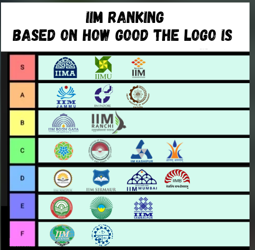
We spend so much time debating IIM rankings based on CTC and NIRF, but what about the visual identity? A logo is the first thing an aspirant sees on their degree and LinkedIn profile.
From the legendary 'Siddi Saiyyed Ni Jali' of IIM Ahmedabad to the minimalist modernism of IIM Udaipur, every crest tells a story. This tier list ranks the institutes solely on design, symmetry, and "vibe." Do you agree with IIM Bangalore being in the D-Tier, or is the sun-and-lines motif actually a classic?
Let the branding wars begin!
4 Replies
-
IIM Calcutta’s wheel and flame are classic A-Tier material. It feels like a prestigious institution. But I agree with IIM Lucknow the globe and green text need a serious 2026 refresh
-
Honestly, IIM Udaipur and IIM Vizag deserve that S-Tier spot. They feel modern, clean, and international. A lot of the F-Tier logos look like they were designed in MS Paint in the early 2000s
-
IIM Bangalore in D-Tier? That’s going to ruffle some feathers! It’s iconic and simple. Sometimes less is more, especially when you’re a top-3 school.
-
IIM Ahmedabad in S-Tier is non-negotiable. That intricate lattice design isn't just a logo; it’s a piece of history. It feels premium and academic at the same time


